The new look of Restoration Hardware Toronto.
Its been a couple of months since I posted an Upload,,,,with things so hectic before going away on vacation at the end of July I didn't have an opportunity to do one of these before we hit the road and then since returning I've been swamped trying to get caught. I've dumped hundreds of photos off my Iphone in the meantime, here's a random look at what I've been up to including; some job site photos,,some great finds, some new finds, some things that insprired and some things that just made me smile.
I popped into RH last week with a client and we stopped immediately in our tracks right inside the door, took a look around and asked if they were open? It was really dark inside even though it was the middle of the day, but yes of course they were open but with a entirely new look! The Toronto showroom had just undergone a complete overhaul, every inch of the store had been painted a dark warm grey, Restoration Hardware's Slate. You'll notice in the top photo they painted out all the mouldings and railings to create a monochromatic look - I love this treatment, it gives a contemporary feel to traditional mouldings and is particulary ideal for creating a gallery look. In fact, its a gallery look they were going for. Gone are the soap displays, paint displays and various nick-nacks and toys, even the hardware is contained and artfully displayed behind glass. They were still busy setting up displays and awaiting delivery and installation of lighting so in the meantime the store is pretty dark.
From an idea in my head more than 6 months ago,,,,, to a sample I approved in July,,,
To installation day a few weeks later.......
In addition to the custom copper hood, the counters and backsplash were installed in Gail's kitchen while I was away on holidays. All the finishing touches are happening this week so Gail can finally
Sourcing some lighting for Gail's mudroom. I've never met a schoolhouse fixture I didn't love..
A puurrrrfectly styled bookcase
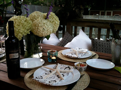
Halfway thru setting the table on the back deck as his highness keeps an eye for squirrels. My new 'Soho' outdoor pillows from Tonic Living seen on the bench.
New exterior lighting for the urban rooftop deck project. Clean and modern looking it reminds me of the lanterns we're accessorizing with. Fixture from Sescolite.
In addition to white and dark grey sunbrella pillows, we're having a few non-outdoor fabric pillows made for the rooftop deck which will be brought out for entertaining. I selected these fabrics from Thom Filicia's collection for Kravet - large scale, graphic, gorgeous!
Speaking of graphic pillows...I was crazy for these quilted pillows that I saw on the East Coast, although you can't get more traditional that quilting - these geometric patterns have a modern feel to me, I'd love to see them in a clean contemporary space. They weren't made locally however, they were imported from Thailand which tells me this is a look we'll be seeing a lot of.
And these,,,,,folksy looking pillows, I regret not picking up a few of each!
I looked at lots of quilts when I was away but still didn't find 'the one' that I had to have. Unlike most of what you come across in many of the touristy stores in Nova Scotia, the quilts in this shop were all locally made by hand and cost thousands of dollars each.
On our trip we ate these almost every day - they were local Indian Point mussels from Mahone Bay and were the best mussels I've ever eaten. I make them at home all the time but I'd never had them like this before. Every where we ordered them they were served the same way, steamed (usually in garlic and wine) and served with a side of melted butter and lemon. Sooo good, I'll be making them this way at home now!
I helped a family member select a new faucet for his kitchen reno.....
It works beautifully with the custom sink I had made for him earlier this summer and was just in time for the new counters to be installed.......almost done. Sigh.
I headed north on a little road trip to survey this chink log home. I'm re-designing its kitchen, 3 bathrooms, a lower level games room and, cover your ears if you're a wood lover,,,we'll be painting out a LOT of knotty pine and giving this rustic home a modern edge.
The interior was a little slice of heaven for me, white, grey, and caramel wood tones, it just doesn't get any better than that for me. A view into the master bedroom on the second floor, the chink logs are visible around the lower section of all the perimeter walls. The plank floor boards are gorgeous and look stunning with the weathered grey logs. To the immediate left is an ensuite which will get an overhaul.
A few irresistables at Angus & Company, (perhaps my favorite shop in TO) talk about wanting one of each...., yes please I'm so looking forward to fall!
Oversize bowls, fringe,,,,,seagrass. sigh.
I'm wild for b&w accessories these, lacquered boxes look great in any room.
B&W pillow detail.
I've been craving hits of yellow since my trip out east,,,I found these silk pillows at a consignment shop the other day and I just might have to buy them for myself. In fact they're much brighter than they appear in this photo, in person they're a vibrant canary yellow - I think they'd make any room sing.


